
Visual Identity of Nagykörút, Budapest
Open Visual Identity Design Competition
Location:
Budapest
Designer:
Bálint Lach
Year:
2025
Award:
2nd Place


In the summer of 2025, BKK (Budapest Transport Centre) announced a design competition as part of the Grand Boulevard’s overall renewal. The objective was to bring a fresh visual perspective to this iconic urban corridor, reflecting its revitalization in the city's everyday life. The goal was to create a unified yet highly adaptable visual identity that captures the unique character of each section—Szent István, Teréz, Erzsébet, József, and Ferenc körút—while maintaining a cohesive brand image for the entire Nagykörút.
Read more
The Budapest Image Guide provides a detailed framework for the city’s unified visual identity, a system already adopted by various municipal organizations. However, the Nagykörút project demanded a different approach. Rather than representing a single entity, the Nagykörút is a vital public space and an essential stage for the community life of Budapest. Consequently, the visual concept required a shift in perspective: moving beyond corporate guidelines to create an identity that resonates with the living, breathing fabric of the city’s most significant urban corridor.
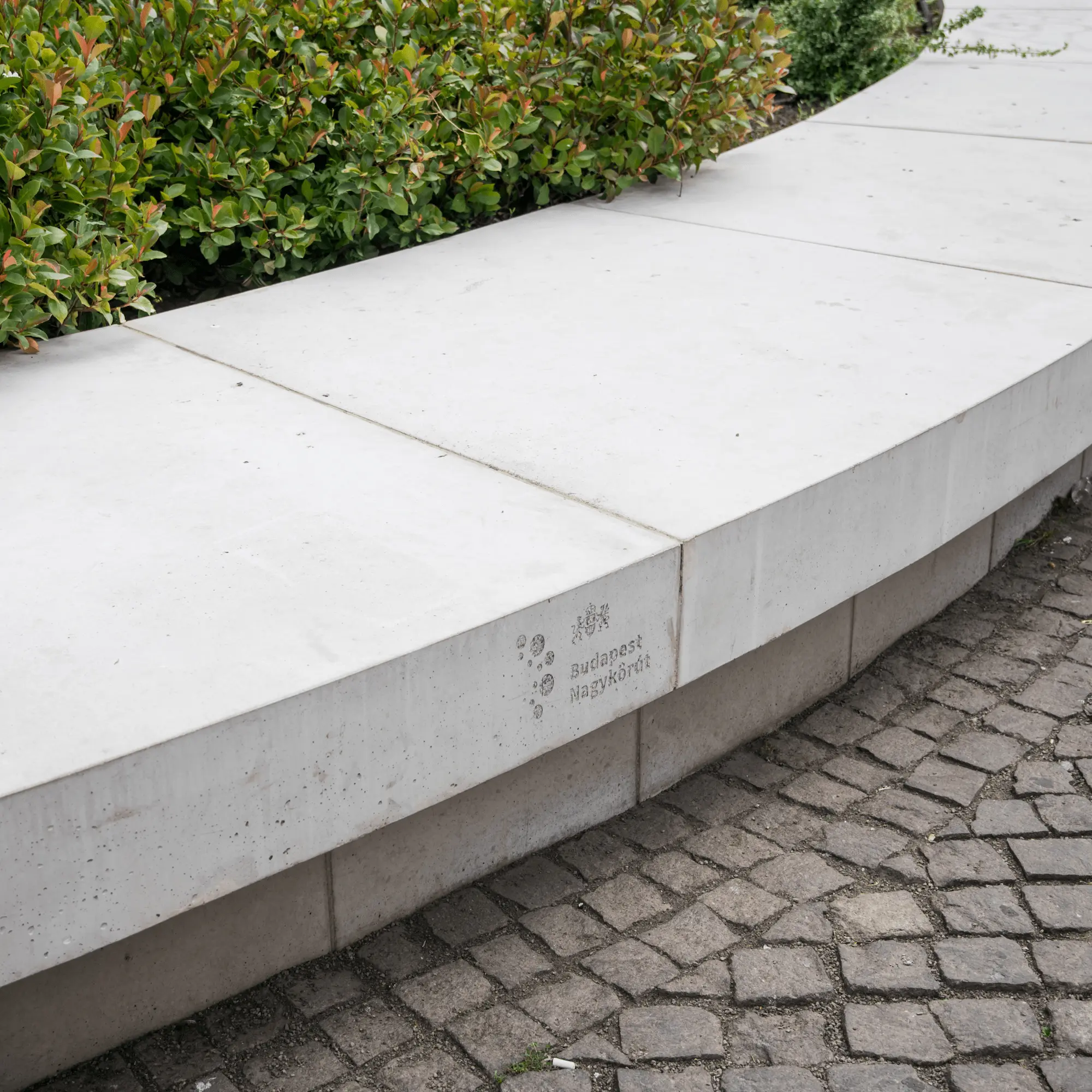
Throughout the design process, I adhered to the core principles of the Budapest Image Guide while introducing subtle, intentional deviations. A key feature is the logo’s form: instead of a closed circle, it is a ring segment based on a semi-circle—mirroring the actual layout of the Nagykörút, which does not form a complete loop. This open-ended geometry creates a flexible framework for future growth and adaptation, allowing the conceptual system to be extended to other boulevards or urban corridors as the city evolves.
The color palette remains aligned with the official Image Guide, but with a strategic nuance: the primary dark turquoise shade is closely related to the mandated dark green, yet it offers a fresher, more vibrant aesthetic. This choice consciously reflects the existing urban character elements of the Nagykörút—such as the candelabras, waste bins, bollards, and advertising pillars—whose color schemes naturally oscillate between blue and green tones. In the context of the official guidelines, green symbolizes renewal, nature, and green infrastructure, making it exceptionally relevant for the revitalization of the Nagykörút.
The ultimate goal was to create a harmonious and understated, yet characterful identity that integrates seamlessly into the existing urban environment while remaining distinct from the branding of municipal organizations. In this way, the Nagykörút logo becomes more than just a visual element—it serves as the expression of a new type of urban identity.